
Introduction
Data visualization is the process of taking large amounts of data and turning it into something that’s easy to understand. This can be done by using charts, graphs, or other visual representations. It’s a great way to ensure that your data has been properly interpreted and allows you to see trends or patterns in your data that might not have been obvious before.
1. Plotly
Plotly is a cloud-based graphing and analytics platform. It lets you create interactive, publication-quality graphs and dashboards with R, Python, MATLAB, Google Sheets (or any other spreadsheet) in minutes.
Plotly’s API is the easiest way to create interactive graphs online using your data. It also makes it possible for anyone on your team who can use Plotly’s web app to make beautiful visualizations without having to learn any code at all!
Plotly offers free plans for individuals up through teams of five people; after that point there are paid options available starting at $49 per month per user (which includes unlimited users).
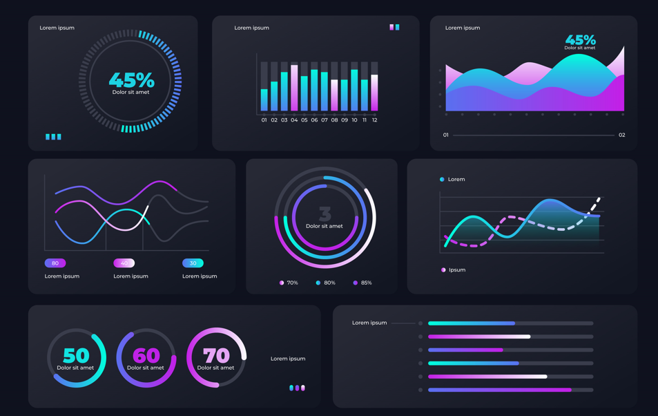
2. Visual.ly
Visual.ly is a free, easy way to create and share infographics, presentations, data visualizations, and other content. It’s great for beginners or more advanced users who want to make their work look more professional.
Visual.ly is one of the best tools for creating visualizations because it has everything you need: templates for every type of visualization imaginable; pre-built charts in case you don’t want to start from scratch; an easy interface that lets you drag-and-drop elements into your design; collaboration features so multiple people can work on projects together; embedding options that let people embed your finished product anywhere they choose (including blogs); an extensive library with thousands of images available at no charge–and more!
3. Tableau Public
Tableau Public is a free, easy-to-use tool that helps you visualize and share your data. It’s a great way to get started with data visualization because it offers many templates and pre-built visualizations that can be customized to fit the needs of your organization.
Tableau Public also has an integrated sharing feature so you can easily publish your work on social media or other sites like LinkedIn, Facebook and Twitter. You can even embed Tableau visualizations on external sites like blogs or websites!
4. Bokeh
Bokeh is a Python interactive visualization library that targets modern web browsers for presentation. It provides a high-level, declarative interface to create beautiful and meaningful graphic representations of data.
It uses modern web technologies like HTML5, CSS3 and JavaScript to create graphics with the look and feel of professional tools like Tableau or Excel but with the flexibility and interactivity of D3.js
5. Google Charts API
The Google Charts API is a JavaScript library for generating interactive charts. You can use it to create charts from the command line or from within a web browser. It supports many types of charts, including bar charts, pie charts and line graphs.
The API also offers a wide range of customization options including colors and labels on the axes as well as their positions in relation to each other on screen. It’s free to use with no limit on usage (although note that this doesn’t include support).
Conclusion
If you’re looking to get your hands dirty with data visualization, these five sites are a great place to start. They offer different tools and approaches for creating compelling visuals that will help you understand what your data is telling you.
